Rejoice! Church
Rejoice! Church was looking for an update that would function interchangeably through their ministry outreach.
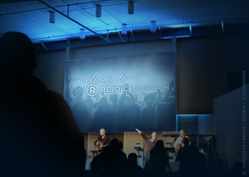
As a shorthand for the name of the church, those who call Rejoice! Church “home” often refer to it as simply “R!”
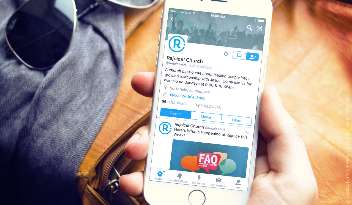
Using this as a point of inspiration, the exclamation point was wrapped around the initial “R” to create an icon container instead of leaving the exclamation point hanging next to the letter. This is useful in and of itself, but in an increasingly digital age it offers the additional benefit for social media icon use and engagement thereof in everything from iTunes media icons to things like social media avatars. An additional (and apt) visual component is how similar the icon looks to a power button.
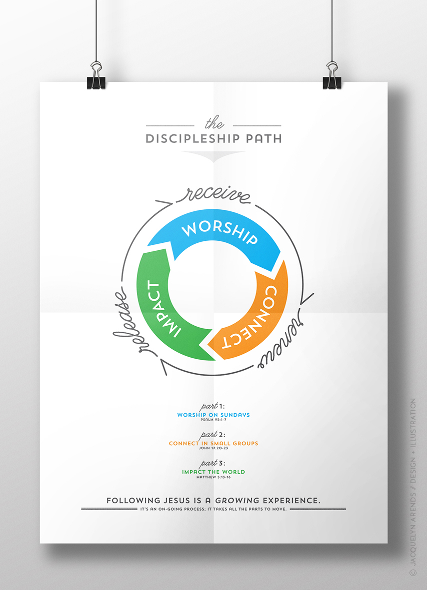
The church follows a discipleship model of Worship (worshiping God), Connect (connecting with others), and Impact (impacting the world). To create a sense of movement, a wheel was used to visualize the idea of how to those three things each move as part of the Discipleship Path. While similar to an existing model that congregants were already familiar (“receive, renew, release”), each model communicates new and existing ideas in important ways. Working in tandem, the ideas flow by receiving God through worship, renewing through connecting with others, and then being released to do outreach outside the church to bring impact globally. The Discipleship Path icon can be utilized with each of these path expressions together or separately, depending application. Much like a wheel, the elements of each individual wheel have to stay connected to stay in motion. In this sense, the intact wheel is what causes the motion; the effects are the results produced by the movement. The concept of a wheel was additionally meaningful as the town is historically known for being an innovative mill town with patents eventually being sold to what is now General Mills.
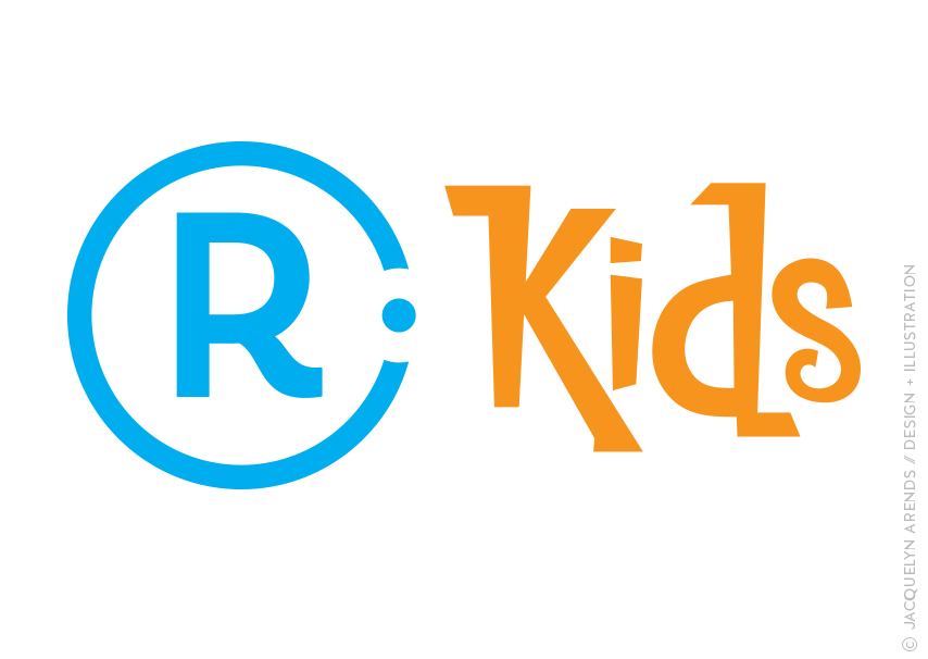
To communicate each core of that path, the colors blue, orange, and green were used to make the distinctions between types of ministries. Blue hues traditionally evoke bright skies, refreshing water, and serenity. Orange is often associated with energy, citrus fruits, communication, and friendliness. Green brings to mind growth, renewal, the globe, and making a difference. Worship is where everything begins and ends within the Discipleship Path, therefore blue was the color chosen as the logo’s primary icon color. The modular nature of the logo allows for use across ministries, including the kids’ ministry logo. Utilizing a lively, custom-made typeface, the R! Kids logo echoes the color system in it as well.
Client:
Rejoice! Church [*This church is now an additional campus of the ministries of Hosanna! Church in Lakeville, Minnesota and under their branding.]
Category:
Graphic Design, Logo Identities


