Conflict Management and Resolution
After years of traditional litigation, the founder of Conflict Management and Resolution started CMR as an alternative to conflict management for those for whom the legal process wasn’t well suited.
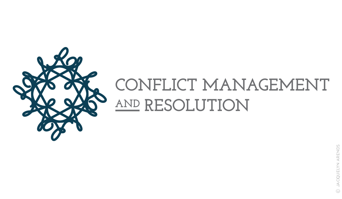
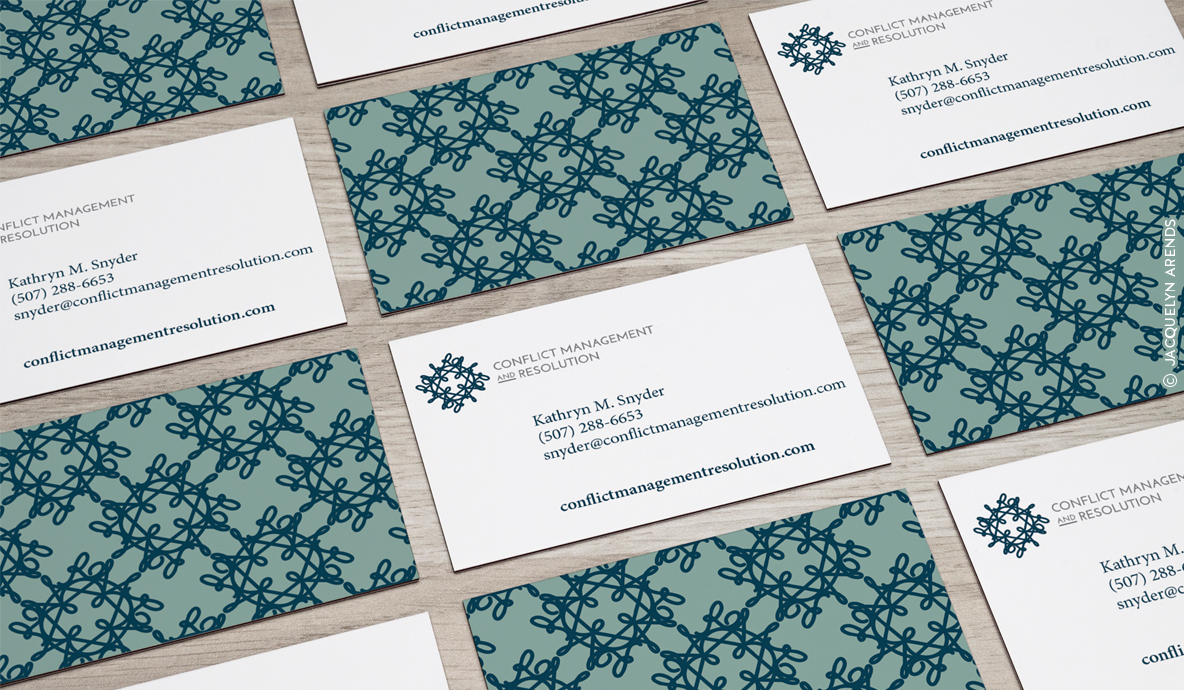
In partnering on designing the logo identity, the idea surfaced of using the logo to illustrate how conflict can appear tangled, but it can also be balanced, transparent, and navigated through mediation.
Like the logo, conflict can have a lot of layers, but there is a resolution in sight. If you look closely, the logo icon is actually an overlapping series of the letters “C,” “M”, and “R.”
Agency:
Category:
Graphic Design, Logo Identities


